
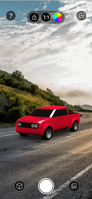
Transforming photoshoot planning with AR vehicle visualization
Crafting a mobile app that allows users to preview different Toyota vehicles in real-scale using augmented reality.
Client
Saatchi & Saatchi
Role
UX/UI Designer
Tools
Figma, Maze
Timeline
Overview
Saatchi & Saatchi requested an app that leverages augmented reality to show a preview of how a life-size Toyota vehicle would look like in a specific location. This app would help Toyota scouters, producers, and creatives find and select the right location for a potential photoshoot.
Design Process
4
Test
Asynchronous + Unmoderated
5
Prototype
Research
Competitive Analysis
As a starting point, we did a competitive analysis for apps similar to what our target users would use, and also for apps that use augmented reality. This analysis was key to allow us to understand what the industry standards are and to identify the minimum features our app would need to stay competitive.

Sample of one of our competitive benchmarking exercises, analyzing existing photography + AR apps.
User Interviews
Research Goal
Understand common user behaviors and experiences around scouting locations for photoshoots to identify the main needs scouters have.
Format
– 10 interviewees (5 producers, 5 stakeholders)
– 3 group sessions
– Via: Webex
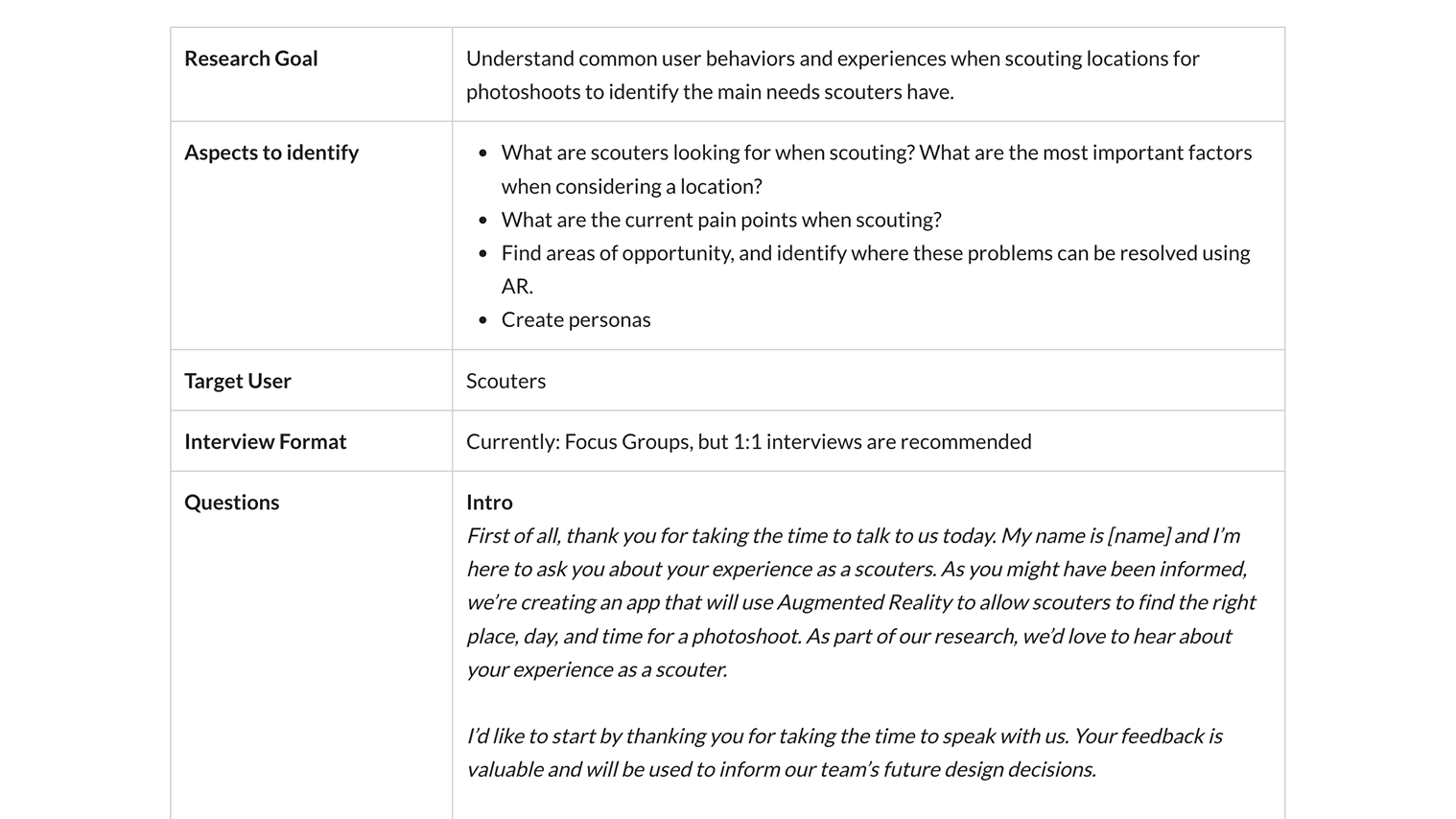
Snapshot of the interview research plan we created for our user interview sessions.

User Research
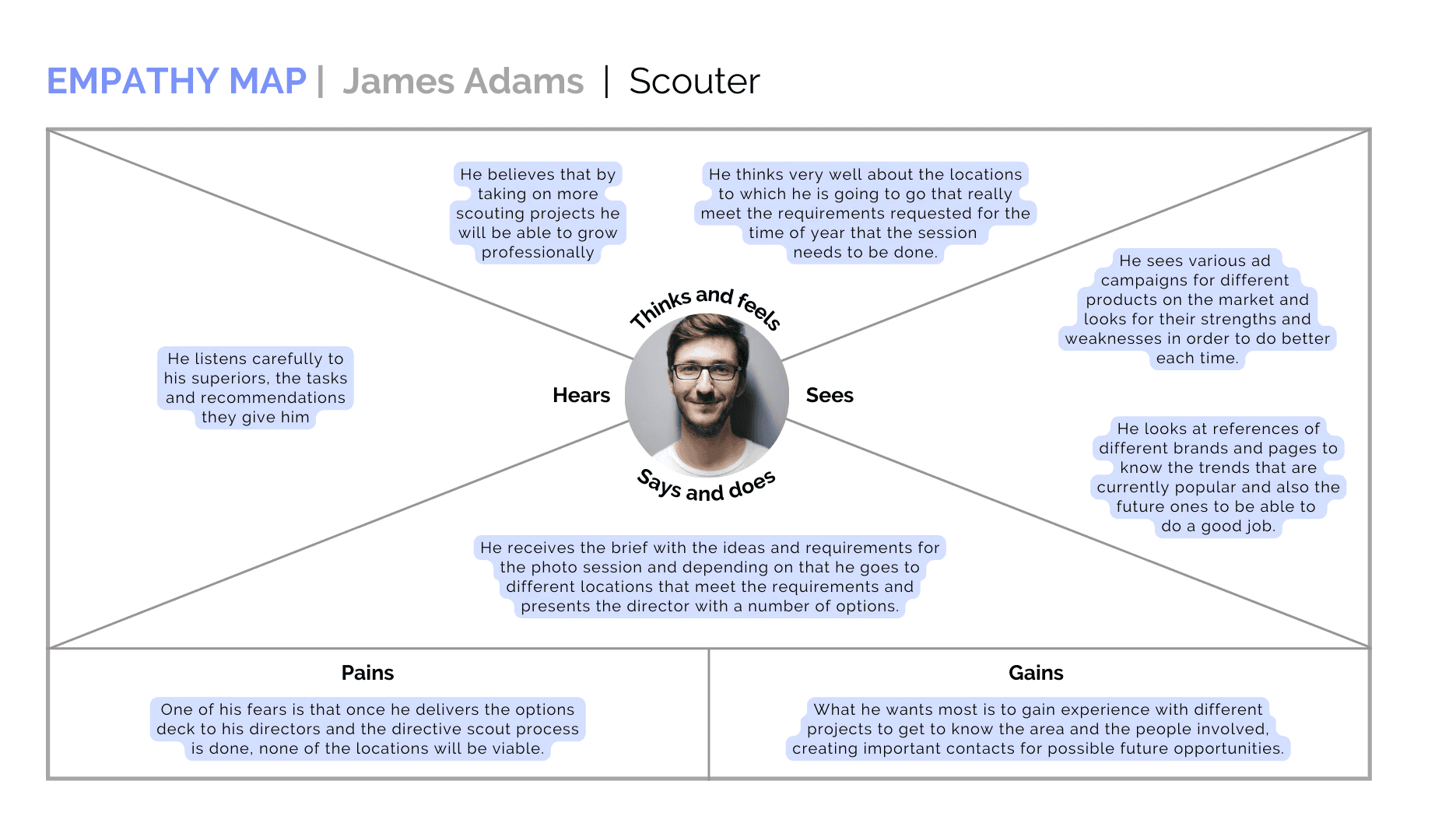
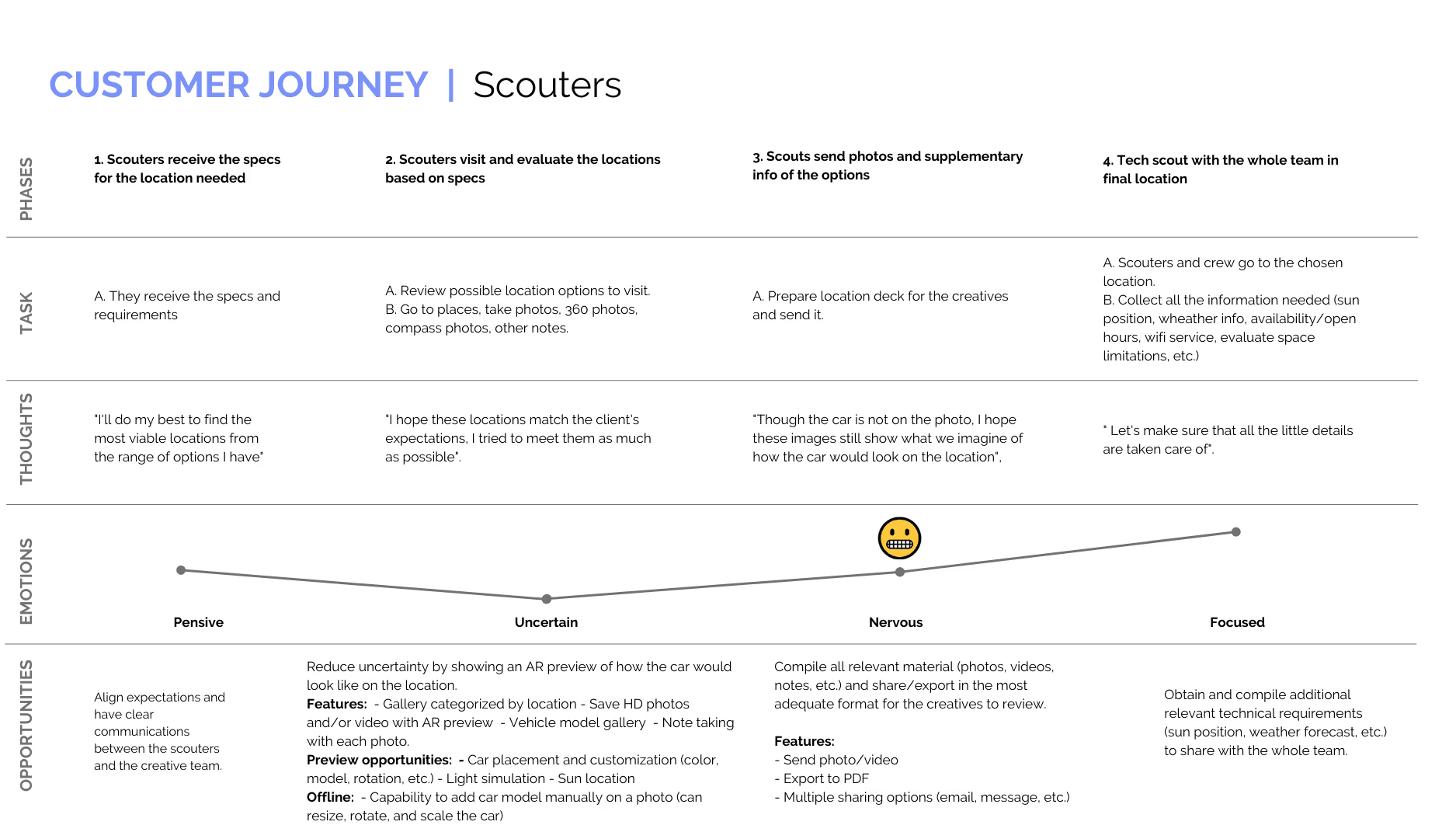
To conclude our research stage, we consolidated our findings by creating user personas, an empathy map, and a customer journey map.
Research Insights
There is a gap in the scouter & creative communication, which can be fixed with an app with the following features:
🚗
Car placement and customization
With customizable elements such as AR vehicle placement, model, size, and background.
🚘
A variety of vehicle models can be chosen to view in AR.
📷
Capture and save HD photos and videos
An in-app gallery that allows users to view and manage the photos they've taken and share them.
🎞️
By exporting images and videos to the native phone gallery.
Ideation
We then moved on to ideating different directions the tool could take based on our stakeholders' requirements list. We created the following user flows based on the main actions or objectives users would have, along with a breakdown of the steps they would take to complete these in the app.
User Flows
We created the following user flows based on the main actions or objectives users would have, along with a breakdown of the steps they would take to complete these in the app.

Sample of our initial user flow brainstorming.
Information Architecture
With the initial user flow laid out, we were then able to define the Information Architecture of the app in a more comprehensive manner:

Design
Once we had a better idea of the user flow and information architecture we would be following, we continued with narrowing down the design of the app. We created low-fidelity wireframes, wireflows, and a UI guide following the Saatchi & Saatchi style guide.


High-Fidelity Wireframes + Prototype
After finalizing what the user experience would be like with the help of our wireframes, IA, and wireflow, we moved to creating high-fidelity wireframes. Compared to our low fidelity wireframes, these new ones now included the style and components we had laid out in our look & feel guidelines.
We also created a Figma interactive prototype, to show it in our client presentations and use it during user testing.

Testing
Once we finished our initial interactive prototype, it was crucial for us to test our design and evaluate its performance and user experience. We decided to use Maze, since it allowed us to import our Figma prototype, combine it with different elements (like likert-scale questions, open-ended questions, and interactive missions), and obtain full reports and insights all in one place.
Test Objectives
Observe the prototype's performance and user experience.
Understand our users' perspectives regarding the prototype's design.
Identify barriers, errors, or opportunities while using the prototype.
Methodology
– Software: Maze
– Testing type: Remote, unmoderated
– Users: 68 total, 18 – 48 years old
User Testing Process
Phase 1: Onboarding & Tutorial
Prototype test + information recall multiple choice
Phase 2: App Functionalities Test
Prototype test for completing various tasks like moving, rotating, scaling, and changing the vehicle color and using the image gallery functionalities.
Phase 3: Follow-Up Questions
Opinion scale questions + open-ended questions on the overall experience using the app.

Test #1 Insights
Our first round of testing revealed areas of improvement in the onboarding phase, and in the app icon clarity.
The onboarding and tutorial should be simplified
Insight: Users felt the onboarding and tutorial was too long, with some of the written onboarding instructions going unnoticed, and with confusion regarding the app's main features.
Solution: Reword and simplify the tutorial, simplifying the introduction of the app's main features while also giving users the option to skip the tutorial and go back to it an any time.
App iconography is a bit confusing for users.
Insight: Most users were able to edit and customize the vehicle, and were also able to intuitively use the in-app gallery. However, there was some confusion between various app icons, where users mistook similar-looking icons for each other.
Solution: Work on the construction of the iconography to ensure they are distinctive. Conduct additional user-testing to validate the best layout + icon usage.
Testing Round #2
A/B Test
After presenting the testing results and communicating that the main revisions include reworking the app iconography, our clients requested a completely new layout for the AR preview mode. However, our team had worries regarding how the new, proposed layout could negatively affect the user experience. To resolve this, we proceeded to do a second round of user testing, an A/B test to identify which prototype layout was more successful.
Test Objectives
Measure the success of 2 different design layouts, to ultimately evaluate the optimum layout.
Evaluate the clarity of the app icons, and identify whether there are still any persisting issues.
Methodology
– Software: Maze
– Testing type: Remote, unmoderated
– Users: 40 users divided into 2 groups of 20
Prototype A
Client's Request

The client requested the Help icon to be on the left of the camera icon, while the Model Library icon to be on the top-left.
Prototype B
Our Proposal
Our suggestion: with the Help icon on the top-left and the Model Library icon next to the camera.
Test #2 Insights
Prototype B showed a higher success rate among participants, while icons still require some tweaks.
Prototype B > Prototype A
Insight: The button panel located at the top in Prototype B is much clearer for the user and, additionally, it is much more scalable, taking into account that the camera can also be used in a landscape mode.
App iconography is still confusing for users.
Insight: It is necessary to adjust the iconography of the gallery buttons and add an image since various users got these confused.
Users had no problems changing the color or looking for help in the app, validating that the 'color change' and 'help' icons don't require iterations.
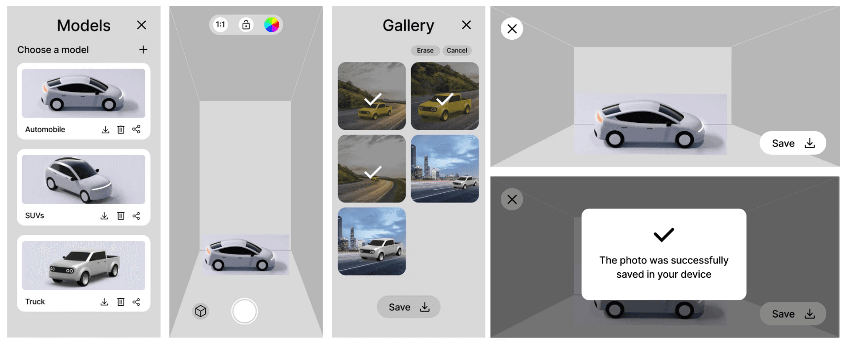
Final Prototype
The insights and next steps defined thanks to our user testing were crucial to help us veer our design to a more user-centered direction, and to solve the pain points we uncovered in our tests. These are the final designs we ended up creating:

Reflections and Takeaways
Overall, through a long, comprehensive process, we were able to design and deliver a coherent design that met our users' needs while also fulfilling our stakeholders' requirements.
Get to know your users.
The insights we gained through our user interviews and user analysis process was invaluable. They drove our initial decisions, the features to prioritize, and the direction the design took.
When in doubt, user test.
Doing 2 rounds of user testing was essential to helping us inform our design decisions, validate and justify them for stakeholders, and ensure our designs stayed aligned with our users' needs.
Iterate constantly.
Every round of iteration allowed us to uncover and address usability problems early on, ensuring that the design gets closer to fulfilling our users' needs with each iteration.